Until Site Studio version 6.9.0, creating components was only possible using the UI. With version 6.9.0, Site Studio has been enhanced with a new function that allows developers to create their own components by coding them with HTML, CSS and Javascript.
Developers will be able to extend Site Studio capabilities by defining their own custom components. This will enable Site Studio to have functionality that previously could not be built with Site Studio elements.
JavaScript developers with minimal familiarity with Drupal can easily integrate custom components into Site Studio without relying on a Drupal developer. The involvement of a Drupal developer is limited to the creation of a module and file structure. This approach ensures that Site Studio is highly extensible and capable of functioning as a standalone system or seamlessly integrating with any required custom development.
Custom components
Custom components share the same behavior as standard Site Studio components, but they are defined through custom code rather than config entities. These components, developed in either Javascript or PHP, serve to enhance the capabilities of Site Studio, allowing for solutions to meet specific customer requirements.
In the next few chapters, I will explain the creation and structure of a Site Studio custom component.
File structure
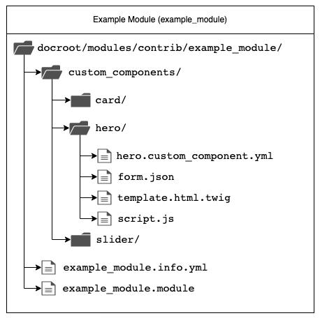
Custom components need to be placed into a subdirectory named custom_components in a custom Drupal module or theme. The recommendation is to place each custom component into an additional subdirectory as this makes it easier to separate files.
In the example diagram below we have individual card, hero and slider custom component subdirectories inside custom_components that sit inside our example_module.
Definition file
Each custom component must have a “definition file” in YAML format. The custom component definition file name must follow the structure of <unique_component_machine_name>.custom_component.yml
Required properties:
- name - Custom component name.
- category - Define what category the custom component should be assigned to.
Optional properties:
- preview image - String that contains the filename of the component preview image.
- availability - Restrict access to specific content entity types and bundles.
- template - String representing the file path to a .twig file used to render the component.
- html - String representing the file path to a .html file used to render the component.
- form - Specifies the path to the JSON file that contains the structure of the component entry form.
- js - Specify local or remote Javascript files to be attached to the page when rendering this custom component.
- css - Specify local or remote CSS files to be attached to the page when rendering this custom component.
- dependencies - Specify Drupal libraries that should be attached to the page when rendering this component.
Template file
In the definition file, properties template and html contain the path to the template file relative to the location of the custom component definition file.
If we have a dynamic component (a component that contains content (text, images, videos, …) that is entered by the content editor) we will use the template property in the definition file and create a .twig template file. In this file, all field values (fields that contain text, images, videos, …) defined in the custom component form are accessible via the field variable.
The html property is used when we have a static component. For example, static components are containers or wrappers. Those components contain markup text that never changes and does not contain content. In this case, we will create a plain .html file.
Example .twig template file:
{# Available variables
  {{ field.input---name }} - Name
  {{ field.plain-text-area---description }} - Description
#}

<div class="name">{{ field.input---name }}</div>
<div class="description">{{ field.plain-text-area---description }}</div>
Form JSON
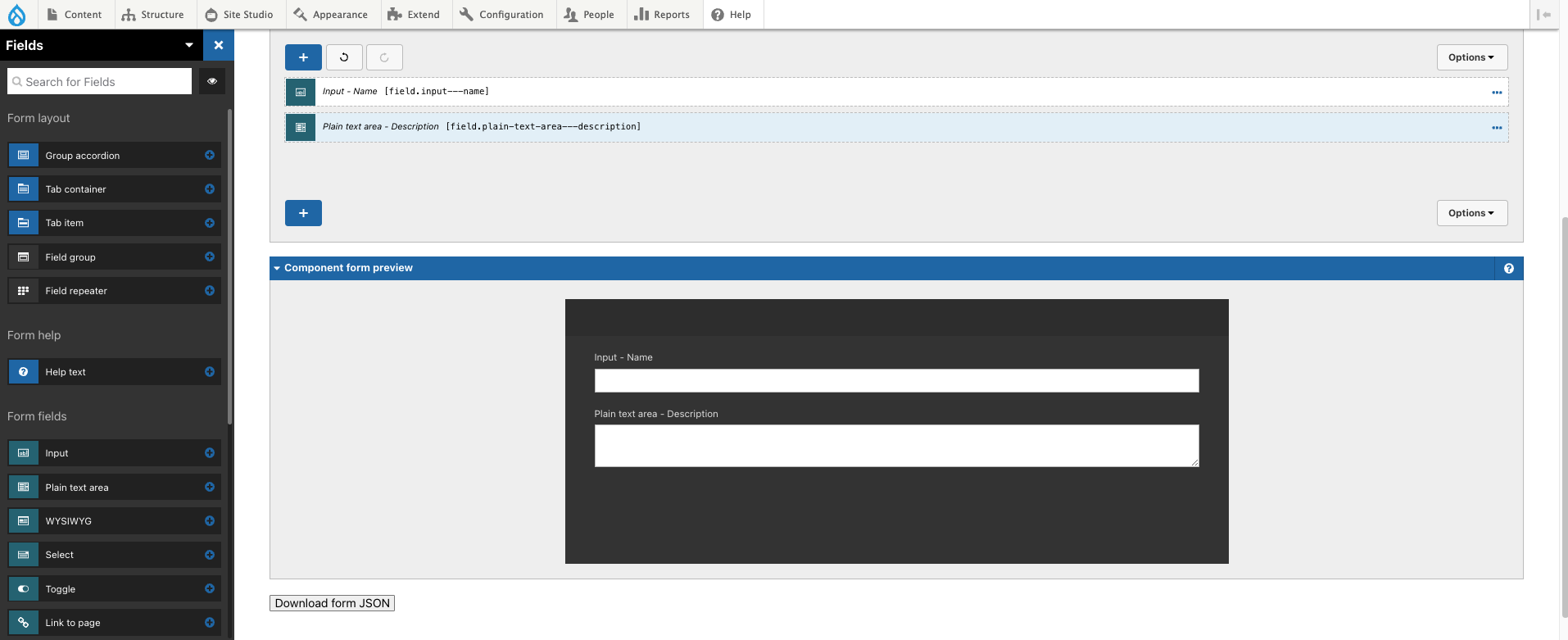
For a component that contains content, we will need a form to enter that content. To build a custom component form, Site Studio provides a “Custom component builder” interface. Navigate to Site Studio > Components > Custom component builder. In this drag-and-drop UI interface, you will be able to add fields and layout to the content entry form.
After form creation, the results will be exported in JSON format to the form.json file. This file should be placed in the component folder and enabled in the component definition file using the form property.
After we create a definition, template, and form file, the new component appears in the Site Studio component library and can be used to build page layouts.
Let’s rock a Site Studio project together!
Merkle offers a Site Studio starter kit! Go live with Acquia at your pace with the package that suits your needs (the packages can be built on top of each other).
- Small – we go live fast in a few weeks by using Site Studio’s predefined components with only little customisations.
- Medium – after a workshop we modify part of Site Studio’s predefined components according to the agreed adjustments.
- Enterprise – based on a discovery and design sprints we adjust the UI Kit components according to the design.
- Custom – we create individual Site Studio components for you that meet all your requirements.